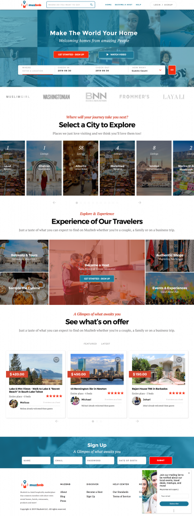
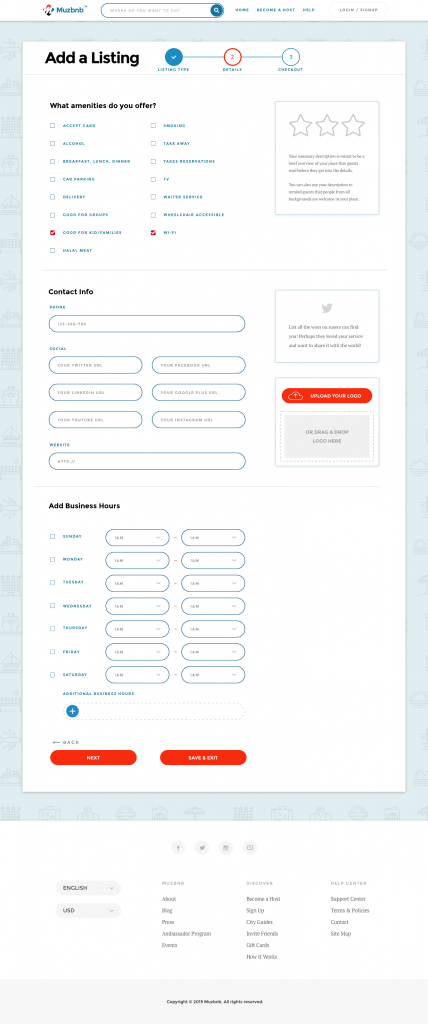
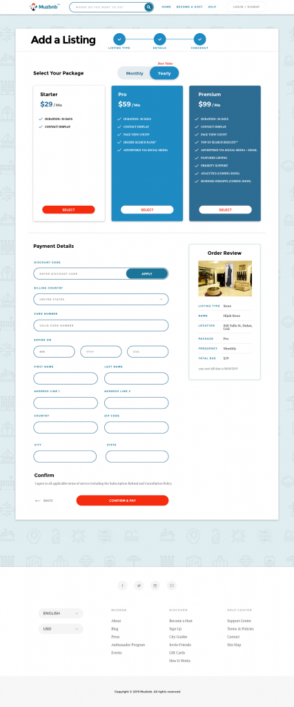
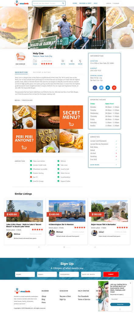
On Demand accommodation booking for the muslim community
We were excited to work on the Muzbnb project because of it’s significance to the muslim community, many of whom are discriminated against when trying to book accomodation through other on demand booking services. Part of our mission is to focus on projects that make a difference in society. We believe in Muzbnb’s bold mission of helping Muslims make the world their home. We assisted with steering design decision making, advising on UX, Designing both the front end and administration sides of the site as well as front and back end development.
I’m not a big reader when it comes to novels and function in general, I just find the fantasy a bit of a waste of time to be honest. But when it comes to books covering practical knowledge on the stuff that matters to me, I’m a bit OCD.
So i’ve been trying to clear out some of the books I haven’t been using in a while and I found a set of real gems from my Web, Strategy, Creativity, Productivity collection. Each of these books has played a major role in helping me get to grips with the range of subjects I need to keep myself informed on as a Web & Creative Professional.
These books cover a wide range of subjects from Coding & Coding Standards, to Productivity, Time Management, Marketing & Communications Strategy, Web Strategy, Usability, Creative Thinking. The information contained in these books should be enough to get any web novice up to speed with the principles and methods needed to dive straight into the web industry. They’re also a great resource or reference for anyone working in this industry or teaching/presenting on these topics.
The Open Brand: When Push Comes to Pull in a Web-Made World
Six Thinking Hats – EDWARD DE BONO
Lateral Thinking: A Textbook of Creativity – Edward De Bono
The 4-Hour Work Week and Timothy Ferriss
The Truth about Email Marketing – Jenkins
rework – 37 Signals
don’t make me think – Steve Krug – New Riders
building findable websites – New Riders
Introducing HTML5 – Lawson Sharp – New Riders
Designing for Web Standards – Second Edition – Jeffrey Zeldman
The Ultimate CSS Reference – Sitepoint
A Designer’s Research Manual – Jenn + Ken Visocky O’Grady
eMarketing eXellence – Chaffey Smith – Third Edition
Starting & Running a Successful Consultancy – How To Books
The Art & Science of CSS – Sitepoint
Logo Lounge 2 – Rockport
I’m planning on selling this entire stash to the highest bidder to make space for some new material.
A few days ago I was approach by a good friend, Jamaal Khan who runs www.jayz.co.za to design & develop a splash page for one of his clients, Studentology. The site he required needed to be completed within 24 hours, which was a tough ask at that point but I obliged seeing things were relatively calm work wise for me at that point. In hindsight I should have known that was going to be impossible considering client feedback cycles testing and changes but I dove in none-the-less.
Grab the Pencil & paper just to be sure
I didn’t want to end up diving in too soon with photoshop and ending up shooting myself in the foot by spending too much time on prepping a look and feel without a clear layout approval, so I quickly threw together a couple of sketches based on the elements the client requested.
First Draft Sketch
I made a quick pencil sketch with some important bits highlighted to outline my thinking on how I planned to approach the page layout followed by a phonecall to make sure I’m understanding what each element actually is and what it’s function/priority is. In cases like this one there’s no need to go the full digital wireframe and a well planned pencil sketch could very much suffice.
Finalised Wireframe Sketch
Using Pre-designed graphic elements to speed up the process
Based on the concept I knew I had to create a box for the competition they were running as their concept relied on the users guessing what’s inside the box. Soi a quick search on google for some freely available vector graphics gave me a few options to work with.
I also regularly collect web elements and graphic styles which provide photoshop layered documents when I need to throw together a quick UI in emergency situations like this one, so I tapped into that folder and threw together a few Photoshop layouts within an hour or 2.
No time to think, just whack it out now
I initially decided to just hunt down an existing free HTML template which had enough of the ingredients to bash into shape. I had to make some quick decisions about how we’d approach the design & build due to the limited timeframe, but also wanted to explore some newer un-chartered territory.
Draft 1 – Graph Paper bg
Draft 2 – Brownpaper bg
I’d been eyeing the CSS3 & HTML5 framework called Less which is now in version 3 of it’s development. With it one can quickly build HTML 5, cross browser web layouts which re-adjust themselves to the specific media or device resolution being used to view it. I also employed a few simple CSS3 techniques to give the design a little spice without needing to use too many complicated background graphics or image text. This included text-shadow, border radius and box shadows as well as background gradients.
Granted not all of these techniques are completely cross browser compatible, but at least with the text-shadow being the least supported feature, I could still have a decent enough looking design in lower end browsers without too many graphics needed.
The full width was really the main focus, so most of the design and styling considerations were applied to work better in this width.
Studentology Full Page Width
This is the main layout suitable for average computer screen resolutions
Once that was established, I had to use the maximum width for smaller more tablet like screens like the iPad for a slightly narrower layout. In this site, CSS media queries are used to switch the width and layout styles for certain elements so they realign and reorder themselves to fit into the new screen width. For example, most of the elements within the blue content area are 30% width and floating to arrange themselves next to each other, which will be switched to a different percentage for smaller screens.
Scripts, scripts and more scripts
To avoid needing additional pages I made use of a jquery fancybox script to allow the video and entry form to popup over the page. I also used Jquery solutions to save space with the competition steps, using a slider to show each step of the process, and for the twitter feed in the footer. JQUERY is your friend, as long as you don’t mix it with too many other Javascript libraries which leads to script conflicts.
iPad width
This is the main layout suitable for tablet screens like iPad
As you can see that some elements are now 50% of the full width of the layout while others are 100%, now changing the layout and order of the elements.
On another note, and even though CSS3 is completely capable of generating the effect I’ve used on the call to action buttons, I stuck to using graphics instead there as I didn’t want to run into too many degradation problems with the call to action items. At least for those elements it doesn’t matter what browser you’re using you’re pretty much going to get a nicely styled call to action without too many hours or device specific code.
Mobile Width
This layout configured to display for small screens like mobile phones
I ran into a few problems with older versions of Internet explorer as you would imagine, so ended up employing a javascript solution called If Oldie, which redirects the Internet Explorer viewer to a plain HTML version of the site which has a fixed width and makes use of XHTML instead of HTML5. I didn’t have enough time to troubleshoot the HTML5 shiv script which comes with the Less Framework and is meant to allow IE to recognize HTML5 tags, so that part didn’t work out as planned.
Even though due to time constraints I wasn’t able to craft everything to perfection I’ve learnt some really valuable lessons by tackling this project in the way that I did.
Use frameworks and existing tools instead of always building from scratch, it helps with rapid development.
Building device specific web pages is easy when you use the right tools.
When you run into problem, don’t waste too much time trouble shooting, change direction quickly.
Collect freely available web resources for emergencies, it’ll save your life when you need it most.
Use 1 Javascript library for all your needs to avoid script conflicts, JQUERY is your Friend!
24 Hours is a ridiculous timeframe so never agree to design & code a page in that amount of time unless you’re gonna hack & smack.
This post basically outlines some of the decision making, tools and processes I employed to whack out a really quick but effective minisite which looks good, works across devices yet still employs some of the latest development tricks. It’s not perfect nor 100% bulletproof but it did the job in the time and budget available.
If I had a little extra time I think I could have implemented a much more HTML5 compliant solution which works across most browser using many of the fallback methods available at this well organised resource.
I’ve hardly slept over the last week bashing my fingers against my keyboard trying to get this site out as quickly as possible. The site is called fani.am, (That’s Fan i am), which is a 2010 World Cup Accommodation site. This one really challenged me with some of the intricate post associations I had to string together, and with the addition of a couple of extra plugins to add some key features I’m really excited about this one.
Take a quick look Design and I’ll explain a bit about what’s under the hood of this one.
Homepage of the fani.am fan accommodation site
I really enjoyed designing this one and also trying out a few CSS3 features like rounded corners & Text Shadows. IE6 users, there’s a special treat for you as well. 🙂
Custom Fields
The most hectic part of this site by far was the wordpress wrangling which takes place in the background. Using loads of WordPress custom fields, some for data and some for associating certain post types like matches, with accommodations and with the teams playing the matches, we were able to weave separate categories of posts into an intuitive mixture of information. Custom field have been managed entirely by the flutter plugin’s write panels, which helped make this site extremely easy for novice user to populate with content.
Fan i am Team Facts sidebar widget
Conditional Statements
Using WordPress conditional statements, as well as some conditional Custom field statements we were able to easily pull the correct set of posts for each team, venue or accommodation. The sidebar also gets populated with related widgets displaying content for each type of page you arrive on.
Associated Matches, accommodations & attractions
Dealing with images
I was a little disappointed about the current state of the built-in WordPress gallery system. You’re still not able to easily pull individual images based on their order in the gallery and can only really pull an entire gallery. The attached image plugin helped pull the first gallery image which was great. Flutter’s image management and upload functionality was ok but could do with the auto generation of thumbs & other sizes which the built in WordPress image uploading performs. Flutter’s image crop & resize functionality just doesn’t work at the moment, though the rest of it’s functionality, mainly write panels played a hige role in this website’s configuration.
This site relies heavily on plugins for various features, which is one of the great things about WordPress. I know some geeky developers who swear they never use plugins, and that’s fine with me, though I or one love the fact that so much freely available functionality is just lying around ready to take advantage of.
Plugins I’ve used & abused Include:
Flutter – custom write panels
Live Coundown Timer – counting down time to the Kickoff
My Favourite Posts – allows user to add their favourite accommodations to a sidebar bucket
Send to a Friend
Tweet News – Footer feed of tweets about FIFA
Google News – feed of news about the world cup from google
Twitter Widget Pro – Worked better than Twitter Tools
IE PNG fix – no need to fiddle with code
Sidebar Login – check the login panel top right
Cforms II – contact & booking forms
DISQUS – Advanced commenting system
WP Table Reloaded – Check the Match Schedule (quick & easy manageable tables)
So far it’s been a really great project and Phase 2 promises to include some even more exciting social media additions. What do you think of this one?
My good friend Jamaal has been really busy taking Jayz.co.za to the next level. I’m super impressed with the way he’s taken his business from a one man show not so long ago, to a team of Social Media Strategists in a really short space of time.
Having designed the Jayz Corporate Identity a while back, and then styling his previous site, it was a welcome experience taking it another step further with this latest re-brand. This re-design focused much more on personal branding, something which I think I need to pay a little more attention to myself, but which Jayz does really well.