
Creating a Quran Journey App
Quran Journey is a Quran Habit building application aimed at helping muslims develop a closer relationship with the Quran. View a web based preview version of the MVP by clicking below from your mobile.
Quran Journey
Quran Journey is a Quran Habit building application aimed at helping muslims develop a closer relationship with the Quran. The original product requirements came in the form a a huge feature set covering a wide variety of content types, functionalities and areas of learning.
Stakeholders in our Organization often approach us with product requests which are a compilation of features listed through management discussions without validation or user research. The ideas are often great in theory but later found to be too complex and highly risky to enter into a long product design & build cycle
Question Assumptions
I started out by questioning the assumptions that a huge all in one app is the right thing to do and by convincing stakeholders to find a good enough underserved need that we can target, validate and scale up from there.
I asked some high level questions about the project’s impact goals and found stakeholders were only focused on trying to create something that gets more downloads than any other app without focusing on the user value proposition or problems they would be solving for users.
Competitive Analysis
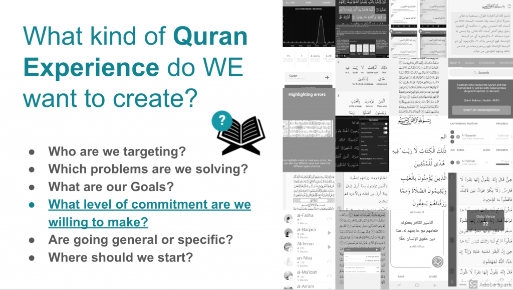
I convinced stakeholders to rethink the plan and allow us to evaluate what already exists out there so we don’t build something which already exists and risk duplication.
I found that the Market for Quran Apps was flooded with a wide variety of products, some highly successful and some barely getting attention, but all of them fitting into a few categories.
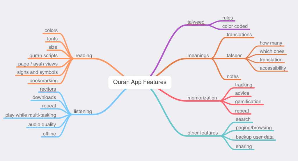
Common Quran Product Types
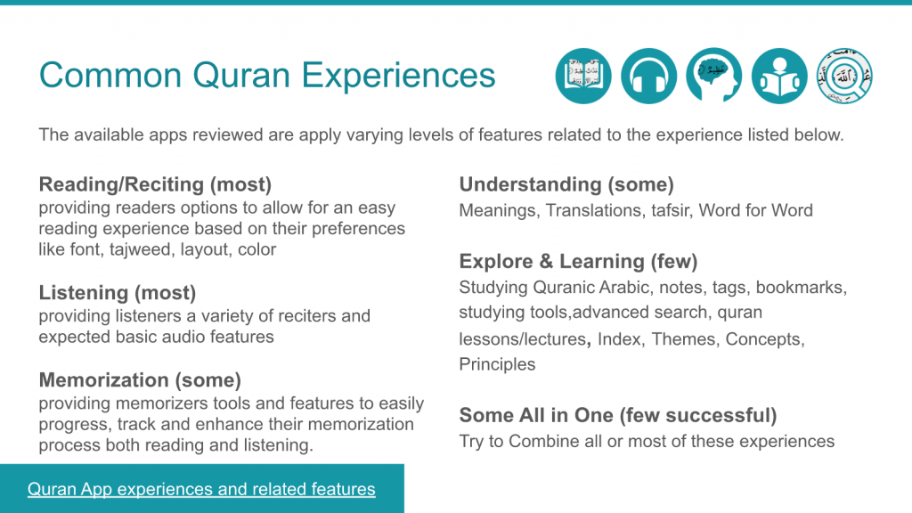
I created a database of Quran related products in Airtable, categorizing them and focusing on major features, reach, platform and rating amoungst other parameters.
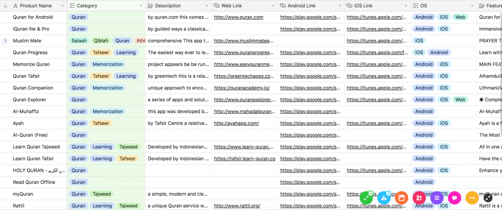
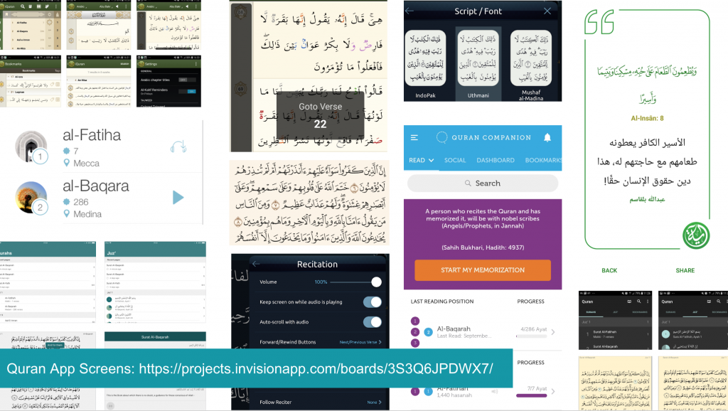
Top Quran Apps Reviewed
I also spent time reviewing app store feedback and trying to understand what mattered to users of the different types of apps.
User Research Planning
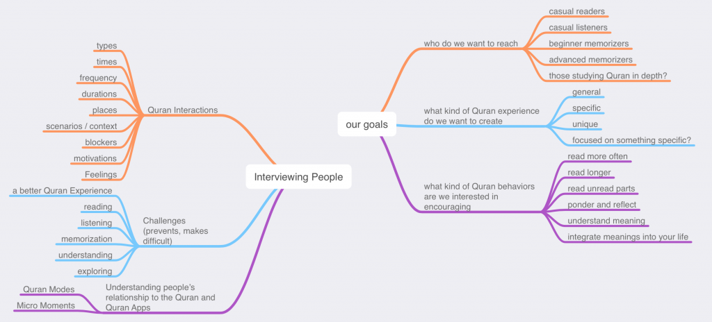
I drafted a user research plan including which areas of investigation to focus on
Uncovering Human Insights
A report of findings covered key insights into human factors when engaging with Quran, their reasons, feelings, contexts, goals, challenges.
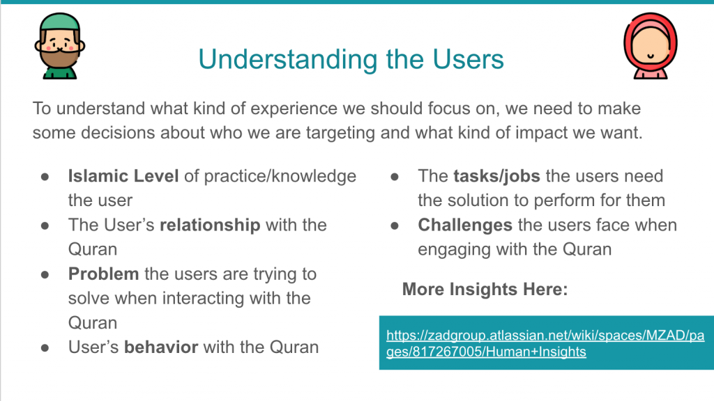
The report linked below contained a collection of insights gathered to more deeply understand what affects Muslim and their relationships with the Quran.
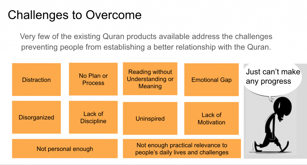
User Challenges Insights
Research Discovery Presentation
A presentation of findings from research focused on convincing stakeholders to select a gap / niche that is underserved and avoid the risk of building another all in one app.
Concept
Developing the Product Concept
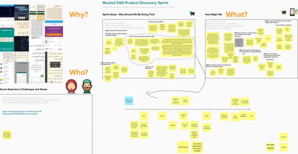
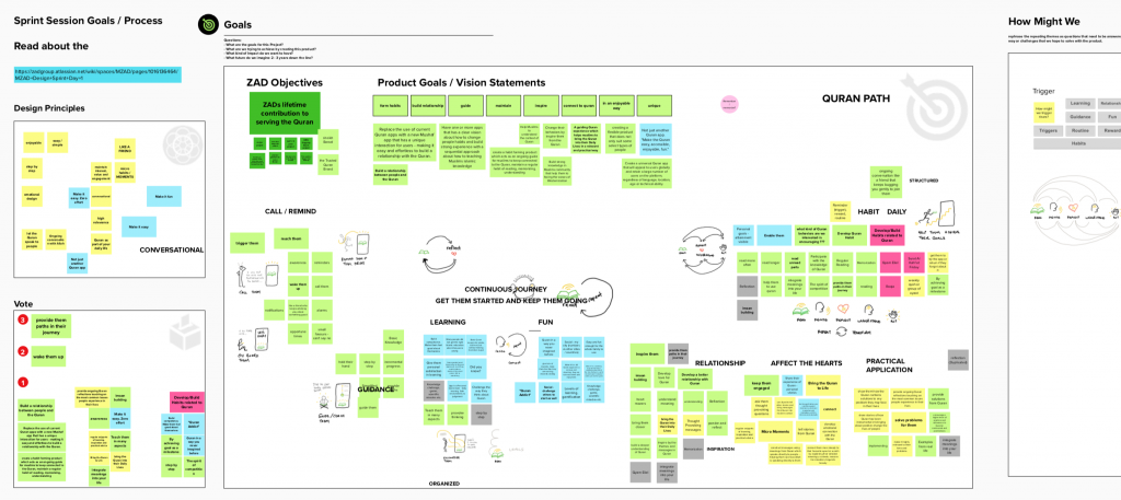
In order to decide on a clear direction, I conducted a series of Design Sprints with our team, leveraging user and competitor insights from the research phase to seed some initial product idea directions.
We focused on who we would target primarily as well as the problems we considered high value impact generating ones if solved.
As a remote team we conducted these sessions using Mural.ly and Zoom.
MVP Concept / World First
I presented our first Concept to stakeholders to convey the main idea.
They were expecting something much more traditional, conservative and filled with features and concept types similar to their original feature request which required a fair amount of negotiation to overcome.
We managed to convince them that what was needed was overcoming the challenges preventing many from developing a better Quran Relationship through establishing a reading habit, something none of the products which existed were doing and which millions of muslims are struggling with daily.
The stakeholders accepted the pivot but were still concerned about the case of an avatar like character with a more childish playful personality, something we spent some time working to overcome through a series of design sprints later.
Story Telling to Convince Stakeholders
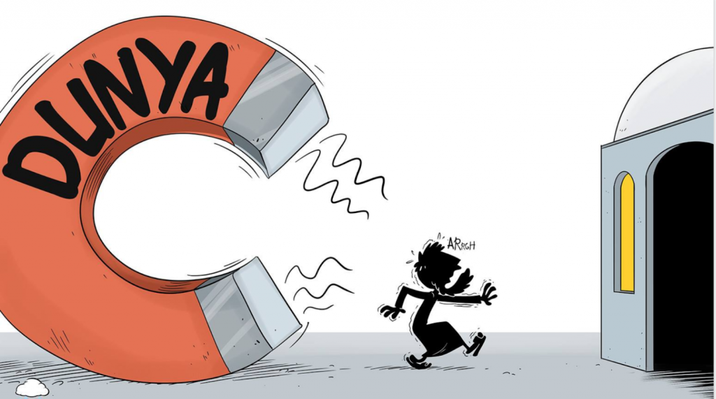
I leveraged the excellent illustrations of The Muslim Show cartoons to weave a story about the reality muslims face to convince stakeholders that pivoting in this direction was what was needed to achieve a valuable impact.
the context 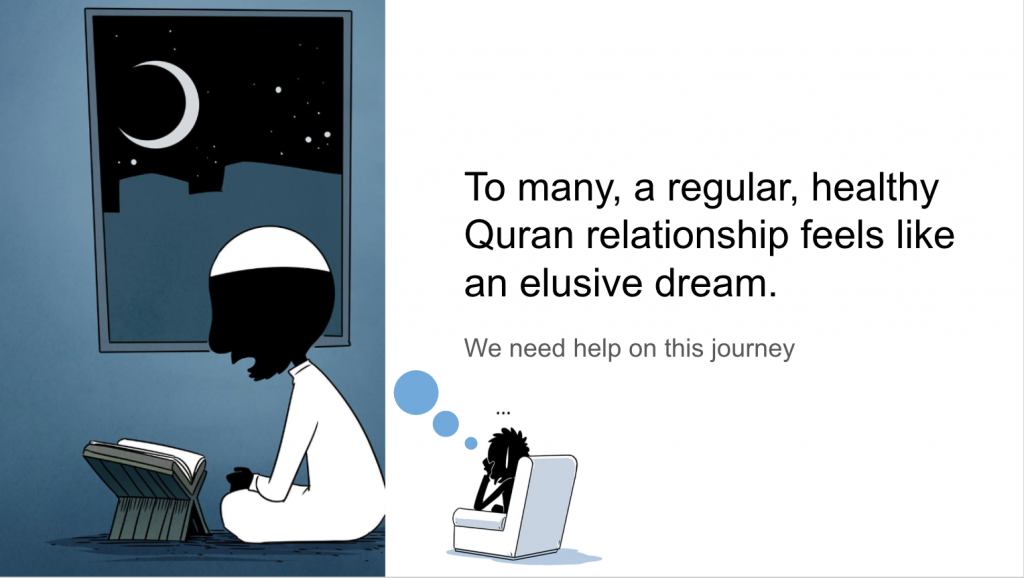
the challenge 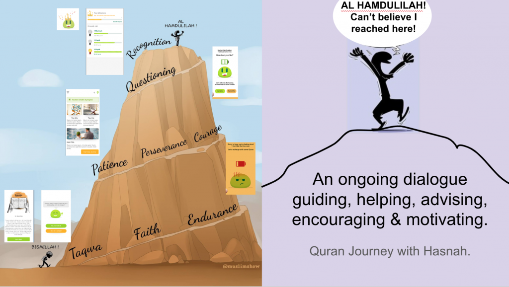
the solution
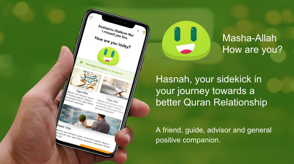
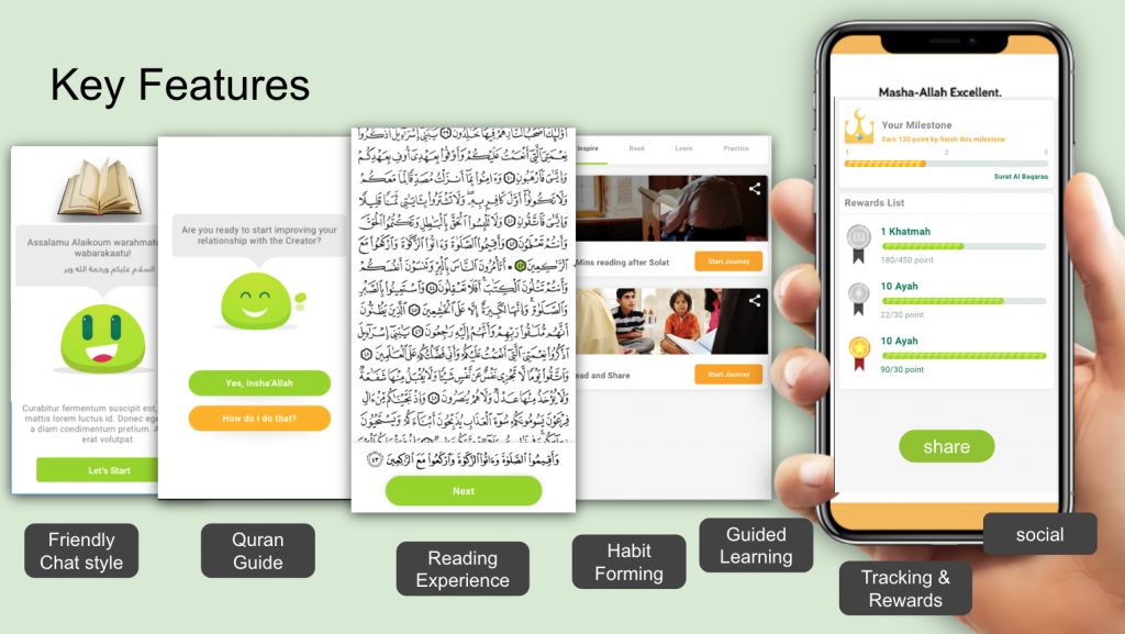
Knowledge Mapping
The core design team them went through additional rounds of mapping out what we know and creating clusters of themes.
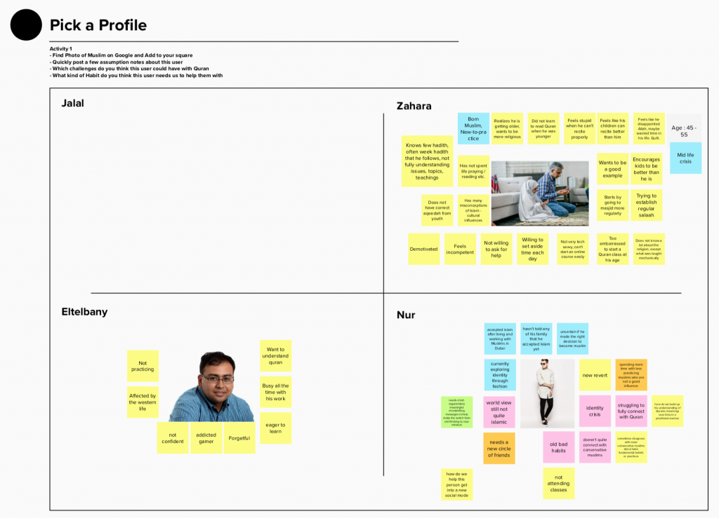
Because of the diversity of user types we may needed to cater for we explored some assumption personas to help the team think through real use cases targeting potential user segments.
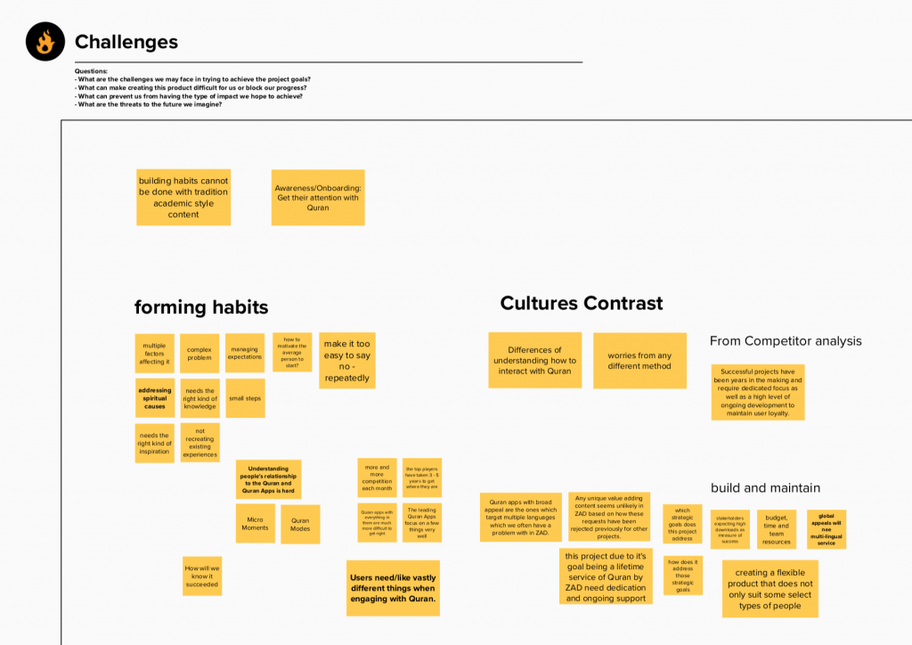
We also mapped out challenges we may face internally and externally in solving the key problems.
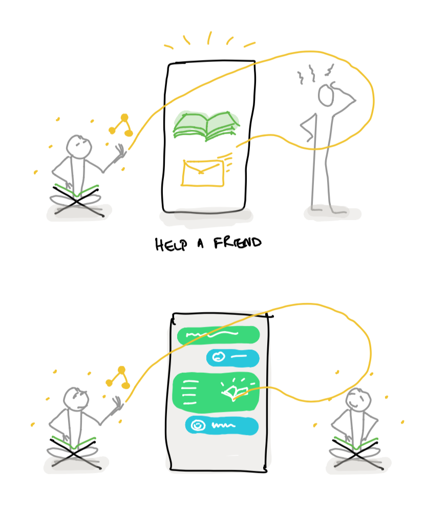
I developed some visual concepts to serve as a basis for our approach to solving the problem and to give the Design team a foundation to build on top of.
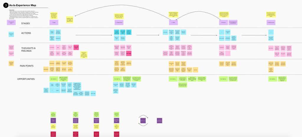
Experience Mapping
We continued the Design Sprint Approach because of the diversity of potential features and to help us choose a core collection of features to cover the widest needs.
Visual Concepts
Low Fidelity Concept Sketches
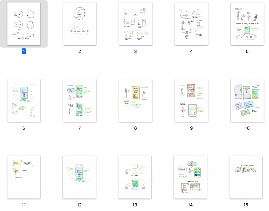
Visualizing the Journey
I blended the visual concepts sketches with an experience map to provide a clearer picture of our process.

Feature / User Story refinement
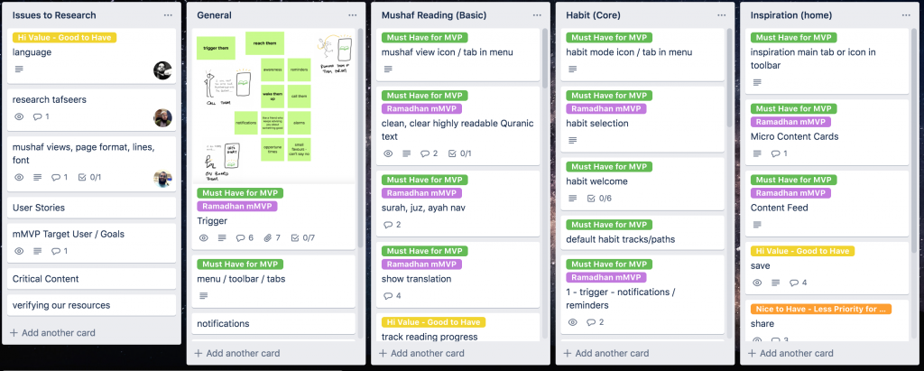
In order to prioritize the focus for delivering the most critical features for the MVP I setup a trello board listing all our proposed features, and working through this with the team to focus on user story details and priorities.
Crafting the Product
Screen Flows
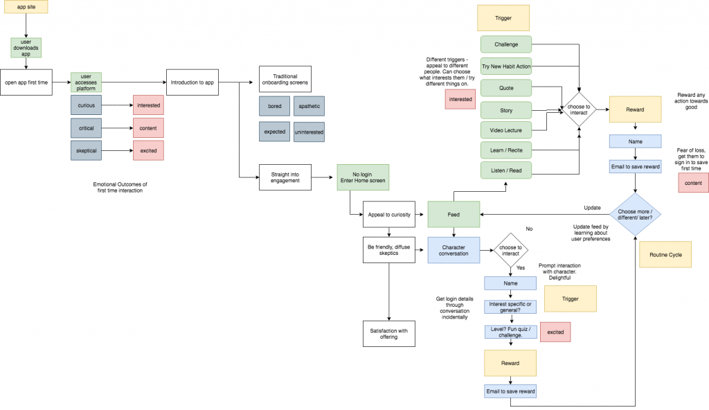
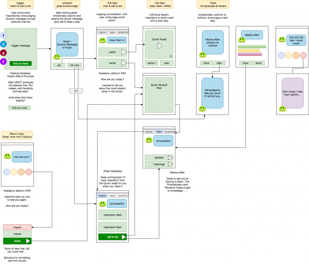
At this point we needed to dig deeper into the actual product and how it guides users through the process of forming a Quran habit in a systematic manner.
Color System
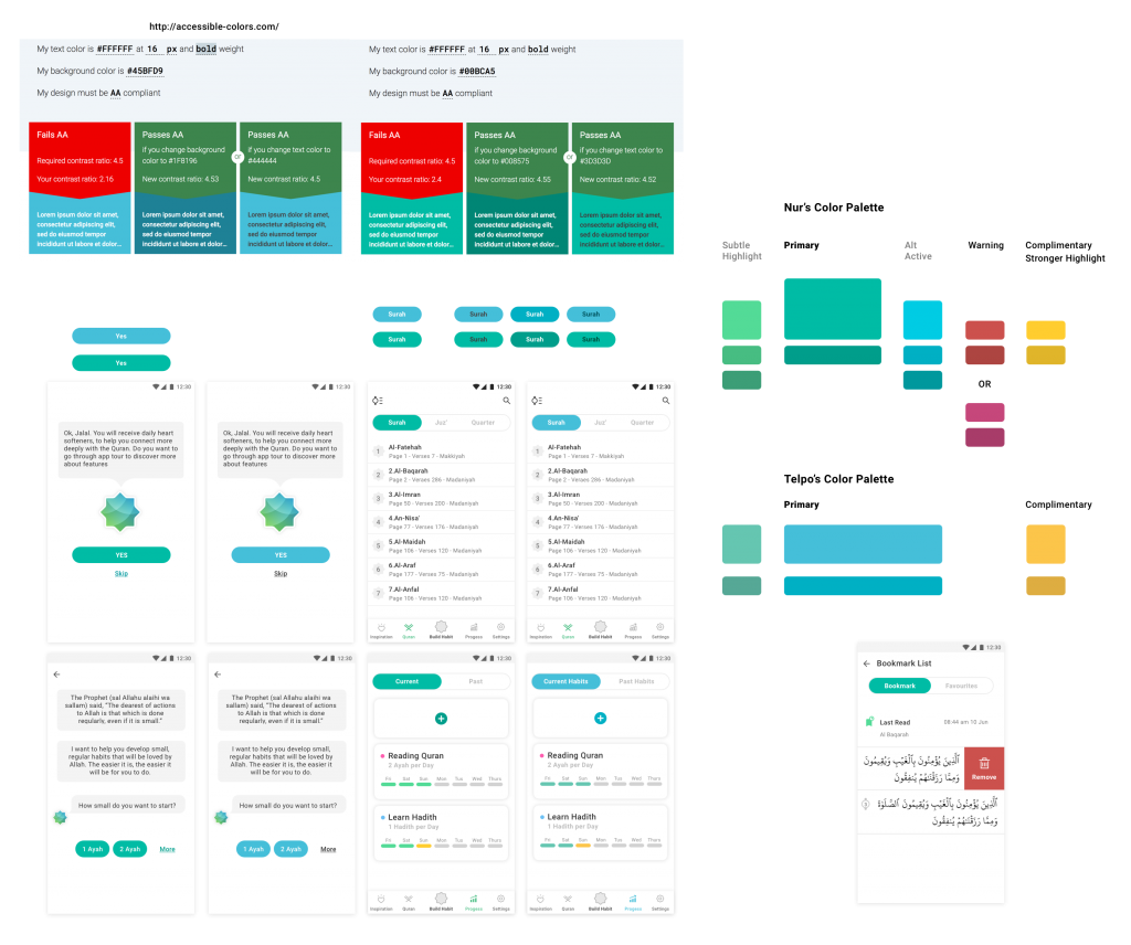
We faced some pretty challenging decisions due to cultural diversity in many areas of the Product’s personality and visual appearance and solved them step by step through a systematic.
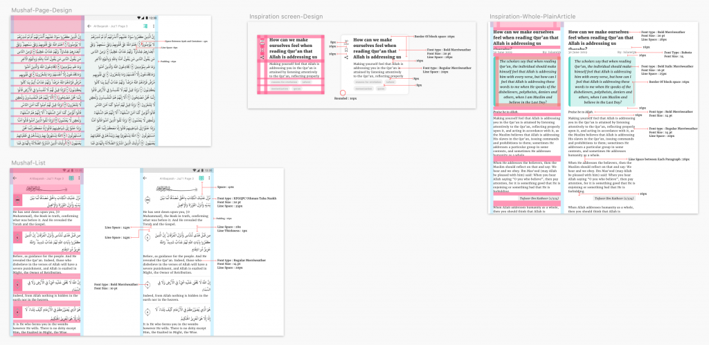
Spacing System
Part of my design direction provided was to encourage a systematic approach to every component of the UI. Space being one of the elements that often gets ignored I emphasized the importance of a consistent and meaningful spacing system which provides the user with order and structure.
Clean & Focused Minimal UI
The end result is a clean, organized and goal orientated UI with a subtle classical yet modern feel, comfortable spacing, a high level of readability and emphasis on the important goal orientated UI elements.
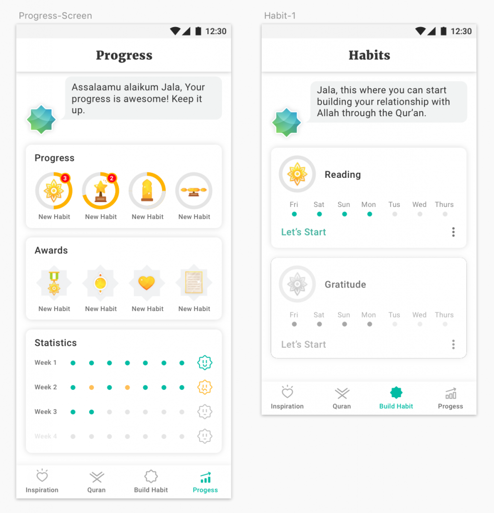
The final UI Design was executed by Our Design Team member Mohammad Eltelbany under my supervision.
Leave a Reply